Millions have been downloading iOS 6 which launched yesterday and since
then have been playing with it to try and locate the new features. One
of the new features is a completely redesigned App Store... which
generally sucks.
The good stuff
Lets get the good stuff out of the way. The new layout on the
**Updates** tab is a vast improvement. The fact that you can update
apps without being kicked back onto the home screen to watch it download
is a big improvement.
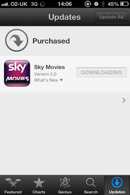 iOS6 App Store Updates Tab
I am also ok with the new app details screen.
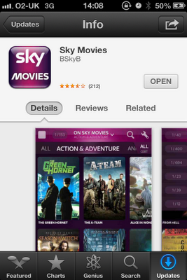 iOS6 New App Details Screen
Sadly, that's all the good stuff out of the way.
The bad stuff
Firstly, I want to talk about the search results as I think this is the
worst part. Apple have gone for a completely different approach to the
traditional list view.
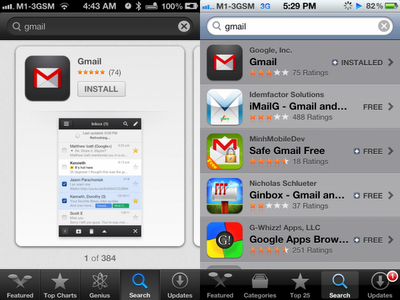 New search results vs Old search results
The new results page (Left) now shows a card layout of one app per page.
If I want to see what other apps have matched my search, I have to
swipe left. By contrast, as you can see on the old search results, I
can see 5 matches to my search just at a glance. This really is a
regression in my opinion and makes the app store really cumbersome.
This change is apparently due to an acquisition of a startup company
called "Chomp" which apple bought earlier this year.
The new style, really reminds me of the Windows Phone Metro style (which
I've had an issue with for a long time). In a metro app, you have to
swipe to the right a number of times, before you actually know what
"tabs" are available to you. On an iPhone app, you generally have the
black tab bar at the bottom of the screen, so at a glance you know what
"areas" this app has. This has always been a sticking point for me
regarding Windows Phone. Apple have now done the same thing, by forcing
you to swipe to scroll through the available apps.
I think this new style will have two impacts.
1. It is now more important than ever to be top of the search results
in the app store for you keyword. Who is really going to swipe more
than 5 times looking for an app?
2. App downloads will be down. Visibility of the apps is now reduced so
much, apps will be getting less exposure.
**Other parts of the App Store**
** **
The rest of the App Store seems to have gone for a "scroll-sideways"
approach, which I think is not natural. The natural use case for a phone
is to scroll down, not across. The new **Charts** lists, is much harder
to use.
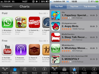 New Charts vs Old Charts
For me, the old charts is a much more natural interface. Choose what
category from the top and then scroll down. Now we have to scroll to
the category and then swipe across...
**Yuck...**